|
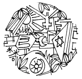
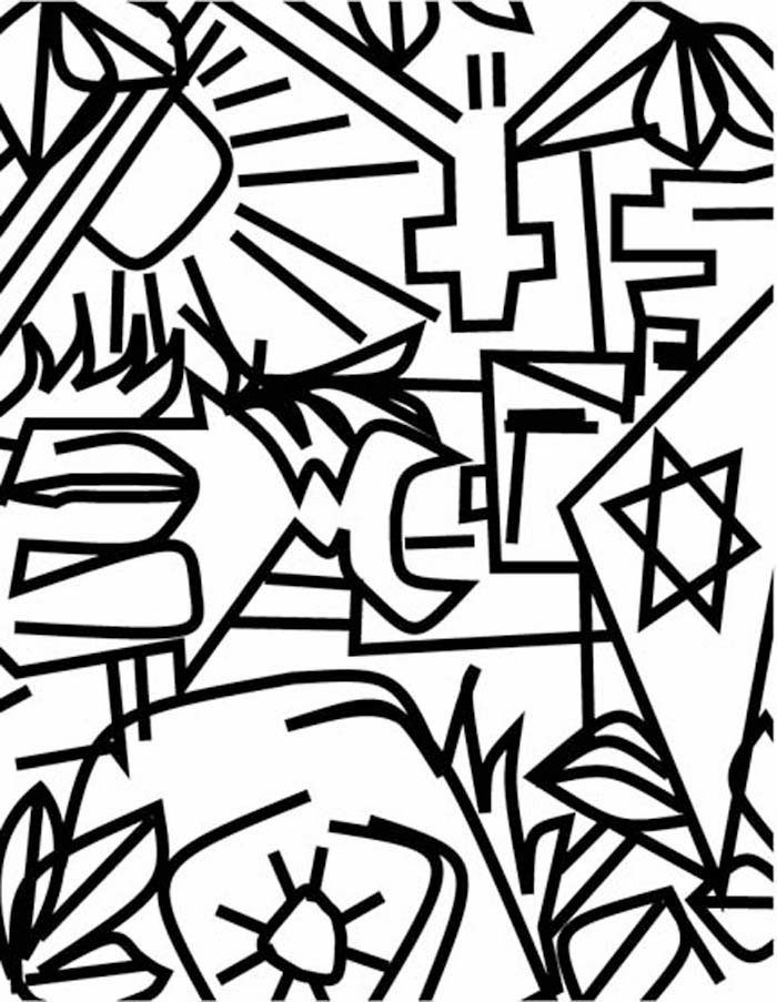
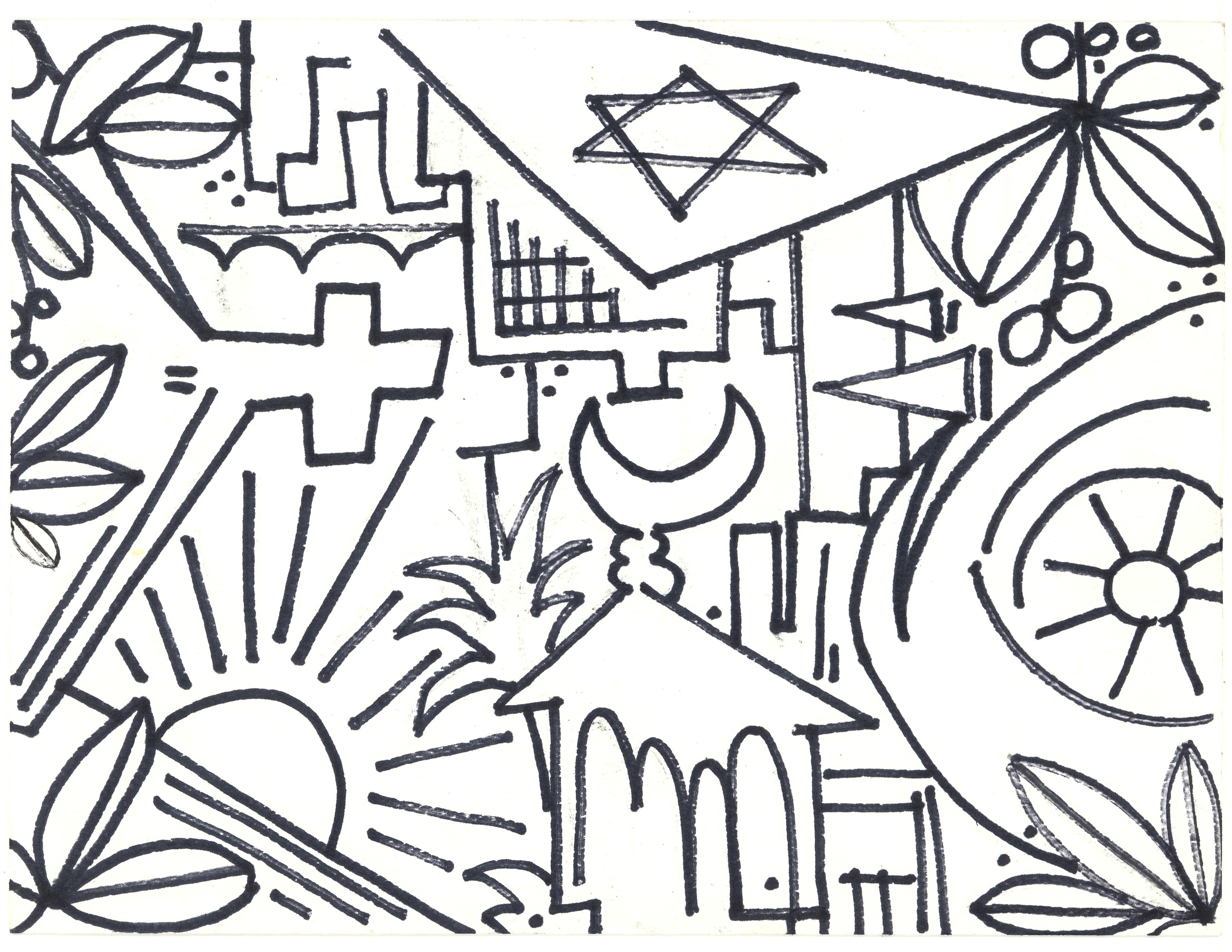
City of God (Circle - NIHIL SUB SOLE NOVI - pen and ink line drawing 2007-2008 Arriba ^)
Below: Early concept design NYC City of God 2001
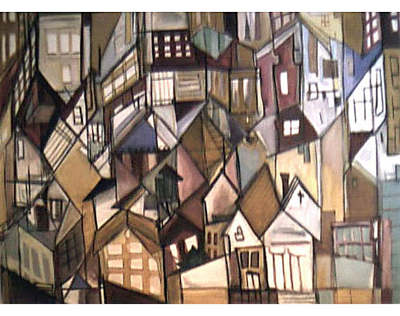
Private collection in Washington DC
"City of God" , 30"x38"
oil on canvas, 2001
|
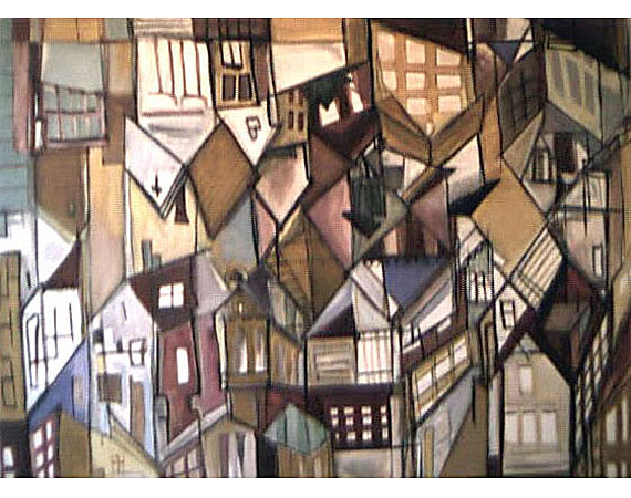
Private collection
"City of God" , 30"x38"
oil on canvas, 2001 (inverse) |
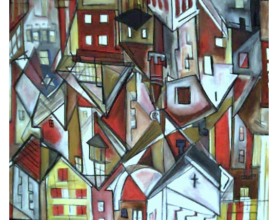
Private collection in New York - City of God (Red)
The work above, painted in red tones, defines the buildings
more clearly and may account for one horizon being stronger
than the other. The picture at the bottom of the page is a
companion piece to the red New Jerusalem. Although all the
works on this page are currently in private collections, the
imagery is a recurring theme in all the landscapes |
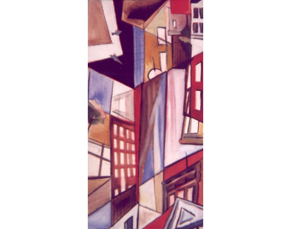
Private collection*
The picture above is a companion piece to the red City of God painting
although it is more consciously intended to be a slice of
NYC; it is also about a fifth of the size of the red version,
although here it is pictured much larger; difficult to accurately
represent paintings in through this magnificent medium; i
like it like that. On one side are pigeons looking up/down
and the trees can gow any which way. I always thought that
the light band crossing the middle of the blue field in the
center was like a spotlight splitting the sky when you look
up between the buildings sometime - or is it the sky?
|
|
Derived from a "common" inversion illusion, these paintings reflect
the complex composition offered by a section of a cityscape where
neither the sky nor the ground, are made available for the viewer.
The work of Armand Thiery on the perception of rhombuses (which
has been used in countless variations by artists since his work
was published in 1895 - and unknowlingly before then) was particularly
important to the development of this work. Thiery's tests conclude
that this shape appears to people as a highly ambiguous figure,
in which two cubes continuously and alternately assert either
their concave or convex form.. This geometry was an appropriate
vehicle for depicting the density of Manhattan at first, and Cairo
in later paintings. The accidental title is taken from cross-sections
of urban rooftops where buildings for worship can be seen.
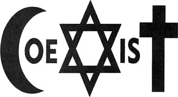
Some of the INSPIRATION For latter Landscape Series is partly theArtwerk of
Piotr Mlodozeniec along with MiryAD Historical References.
Above is a text image by artist Piotr Mlodozeniec whose poster inspired these paintings. A well put common sentiment nevertheless inspirational in Poland and around the world. Another well known son of Poland,
Karol Jozef Wojtyla (Pope John Paul II) proposed the tripartite division of Jerusalem into three distinct zones for
Christians, Muslims, and Jews. This idea of oexistence, certainly not a new one, is not as popular as it could be. If this call is not upheld and repaired and allowed to grow - monotheism might start to lose out to the pantheists (or ahteists even) sooner rather than later. Scary times - love that bumper sticker:D
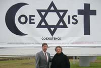 FotoPMc. FotoPMc.
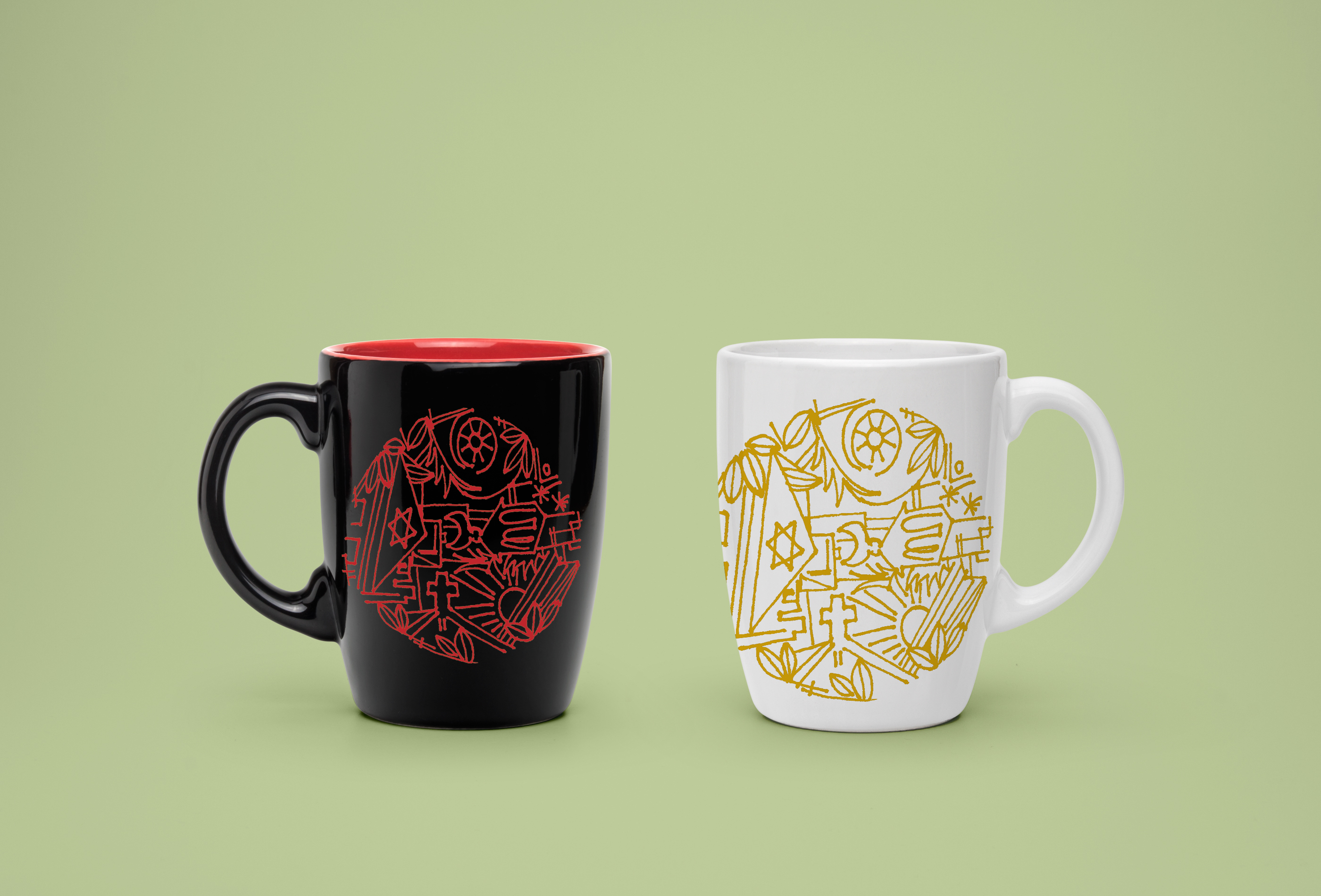
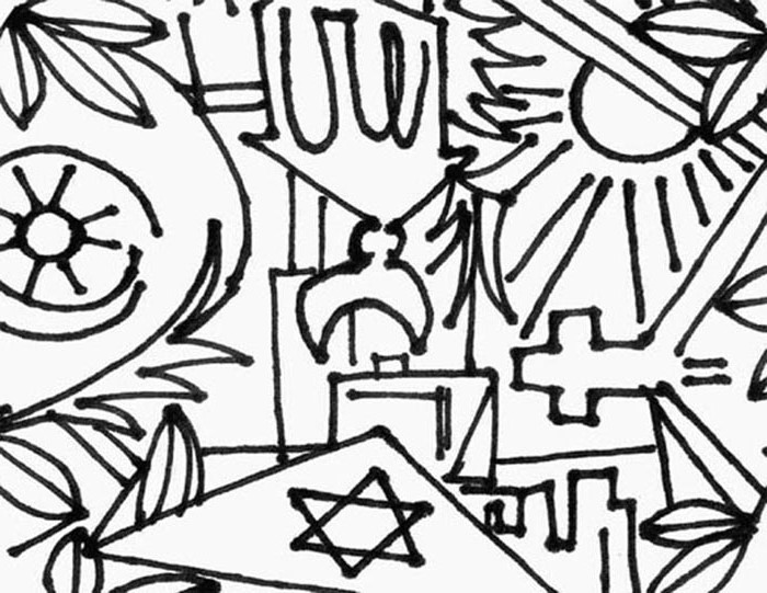
Below is another version of the ecumenical design at the top of the page adapted to a rectangular shape (11X14 collage):
(to learn more about a popular rendition of the idea please visit www.carryabigsticker.com)
<<< BACK
|
|